Mobile App
CONDOMINIUM MANAGEMENT MOBILE APP (OneCondo)
Part of team designing a mobile application which provides condominium managers and residents easy to use tools to manage condominium activities, accounts and communications.
Industries: Lifestyle
Platforms: iOS, Android
Competencies: Research, data analysis, UX and UI design.
Deliverables: Visual design, UX and UI design, research, team collaboration.
Deliverables: Sketches, wireframes, visual concepts, prototypes, style guide.
Problem:
Revamp the current condominium management app to an all-inclusive solution that optimizes operational efficiency and supports the green initiative by significantly reducing paper usage
Process:
Initiated the design process by analyzing the existing app and researching user data. Utilized insights to understand user needs and stakeholder requirements, leading to the defining of clear objectives aligned with business goals. The identified problems and requirements served as a foundation for making design choices, influencing every stage from visual concepts and wireframing to development, ensuring the overall success of the project.
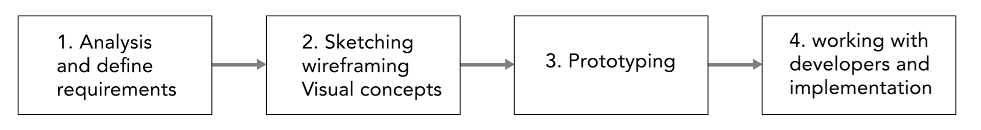
1)
Using research and analysis, I identified and prioritized every problem, documenting requirements for both the design process and approvals. Defining requirements provided direction for a flexible information architecture. Some key points to address included features:
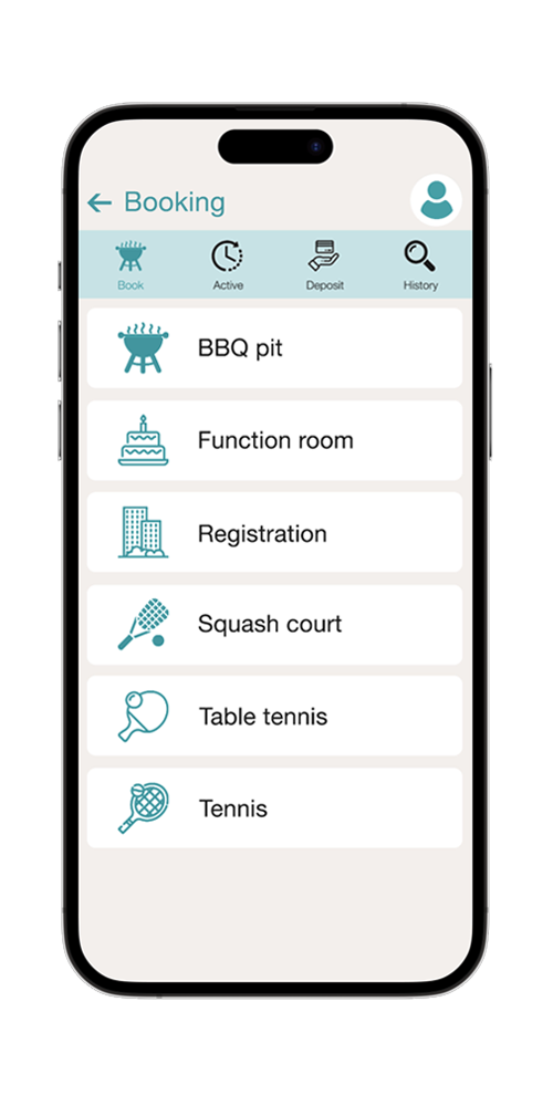
Efficient account and facilities management.
Automated task management.
Streamline communication channels between condo management and residents.
Centralized information access.
Remote access and mobility.
2)
I worked on the information hierarchy and architecture and started with sketches of the key sections to maintain the flow of creative ideas. Some of the challenging parts included:
Balancing functionality with simplicity
Meeting diverse user needs
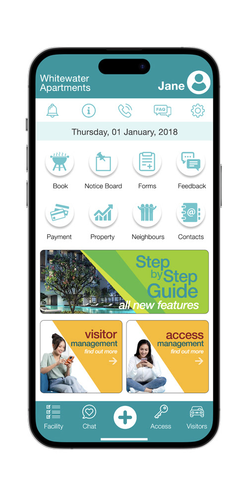
I started with simple wireframes to focus on information organisation and layouts. Samples of design decisions:
Inclusion of notice board on home page
Clarity in error messages and alerts
Use of icons to reduce cognitive load and include language neutrality.
This was followed by multiple design options. After collaborative feedback, elements from several options were combined to set the app's visual direction. Here are two samples
3)
Samples of prototypes:
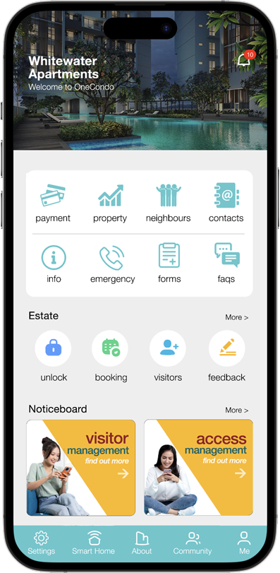
Option 1
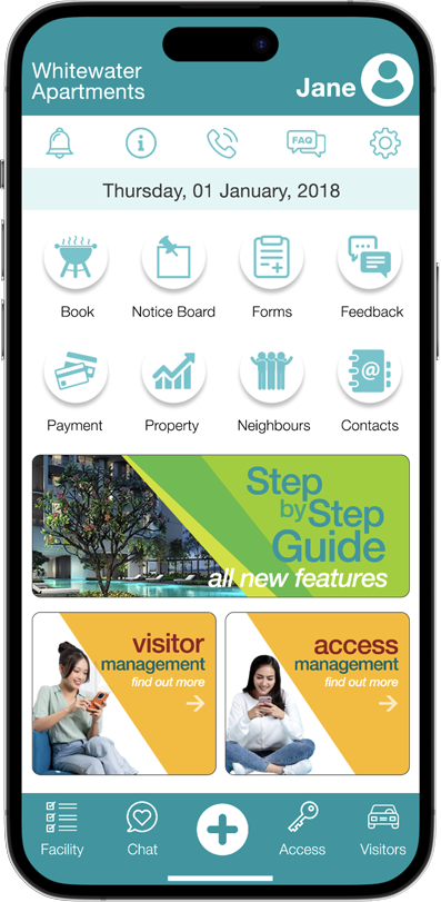
Option 2
4)
Advanced prototypes were created with the team, making iterative changes like adding features, refining visual design and worked closely with front-end developers. Sample of improvements:
Adjusted screen layouts to accommodate both iOS and Android devices
Creating custom icons and adjusting color/contrast
Defined touch targets and updated sizes for accessibility